
3.33Page
Adds a new page to the current panel and sets how that page and its panel appear in the app menu.
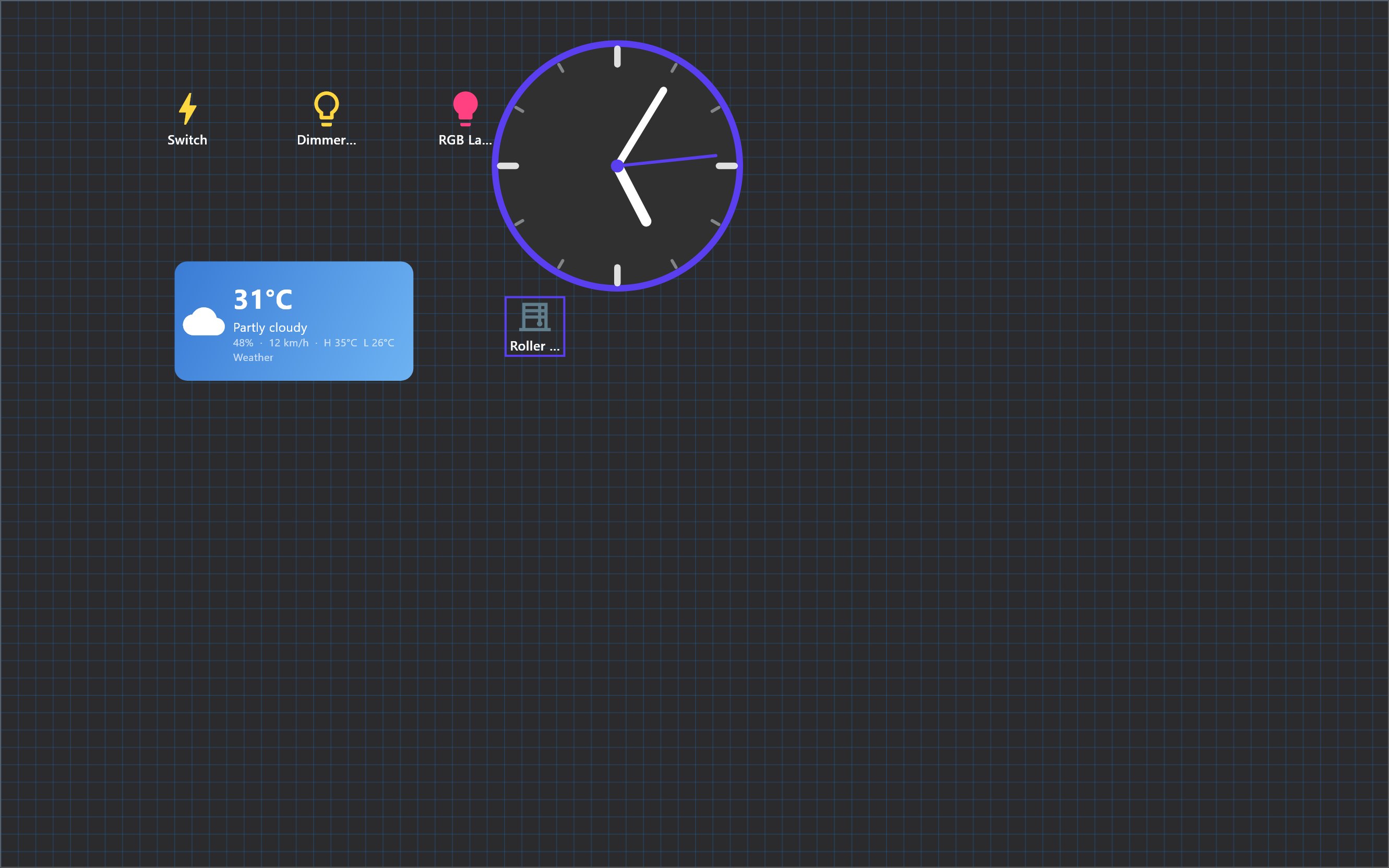
Unlike the other items in the Layout group, Page does not put an object on the canvas. Choosing it from the object palette opens a Create Page dialog and adds a new page to the panel you are working in.
#When to use it
Use it to split a panel into pages. A panel is a top-level entry of the app menu, such as Lights or Cameras. The pages of a panel appear as tabs across the top of the screen, and the objects (switches, cameras, and so on) are placed on the pages.
#What you need first
- At least one panel. Panels are created with Create Panel on the Project page.
- Objects can only be placed on a page, not on the panel itself. If you try to add an object while a panel with no page is selected, the Configurator tells you to create a page first.
#Properties
#Create Page dialog
| Field | What it does |
|---|---|
| Page Name | Required. The name shown on the page's tab, for example Lights. |
| Font Type | The font of the tab label. Starts from the panel's setting, Georgia Bold otherwise. |
| Font Size | The size of the tab label, 10 to 32. Starts from the panel's setting, 16 otherwise. |
Click Create to add the page and open it. The new page inherits the display profile, orientation, theme and menu setting of the page you were on.
#Page properties panel
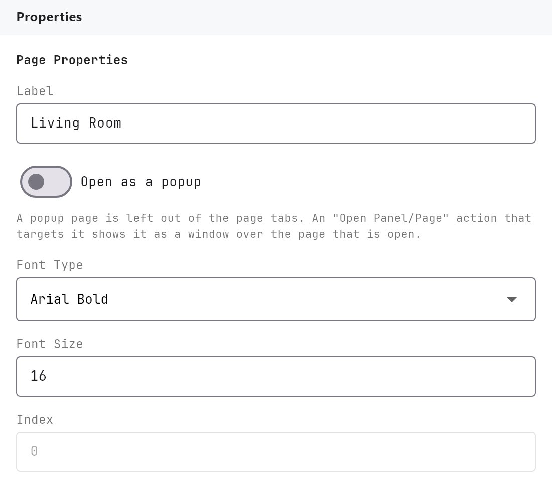
Selecting a panel or a page in the project tree shows Page Properties in the Properties panel, with the fields below. The Page palette entry itself has no object properties of its own, which is why its Properties panel is empty.
| Property | What it does |
|---|---|
| Label | The name of the panel or page. |
| Navigation Picture | The image shown for this panel in the app menu. Choose Picture (or Change Picture once one is set) opens the clipart gallery, Remove Picture clears it. The image is shown in the menu tile only and is not placed on the page. |
| Picture Scale % | Size of the navigation picture inside its tile, 25 to 300 in steps of 5, default 100. 110 makes it 10 percent larger, 90 smaller. |
| Font Type | Georgia Bold (default), Arial Regular, Arial Bold or Verdana Regular. |
| Font Size | 10 to 32, default 16. |
| Use picture as page background | Yes or No (default No). When Yes, the page's picture is used as the canvas background. |
| Index | Read-only. The automatic position of the page in the navigation order. |
#How it behaves in the apps
- Panels in the menu: each panel appears in the panel selector with its Navigation Picture and its Label in the chosen font and size. If there is no picture at all, it shows the panel's initials.
- Pages as tabs: when a panel has more than one page, the Veltnova client lists the panel's pages in its header.
- Picture and fonts: the Veltnova client uses the panel's picture and the font and size of panels and tabs. It does not apply Picture Scale % or the page background setting.
#Example
A Lights panel with three pages:
- On the Project page, create a panel named
Lightsand set its Navigation Picture to a bulb icon with Picture Scale %100. - With the panel open on the canvas, add a Page from the object palette and create pages named
Living room,KitchenandBedroomswith Font TypeArial Boldand Font Size16. - Place the switches for each room on the matching page.
In the app, Lights appears in the panel menu and the three pages appear as tabs.
#Tips and common problems
- A panel with a single page shows no tab bar.
- Swipe between pages. On a touch screen, swipe a page to the left to go to the next page of the panel (the next tab to the right), or to the right to go back. The new page slides in from that side. At the first or last page nothing happens. A swipe counts when one finger moves at least about 70 pixels, mostly sideways. It is not used while the page is zoomed in (the same movement then pans the page), by a pinch, by a tap, or with a mouse.
- Many pages. When the tabs do not all fit across the top, the tab bar scrolls sideways. Use the mouse wheel, drag the tabs, touch-swipe, or press the arrow that appears at the left or right end. The selected tab is brought into view when you open a page. The same bar is shown in the Configurator's canvas preview.
- If the Navigation Picture looks too big or too small in its menu tile, adjust Picture Scale % in steps of 5.
- Page order follows the Index. It is set automatically when you create pages.
- To place a picture inside a page rather than in the menu, use a Picture object.